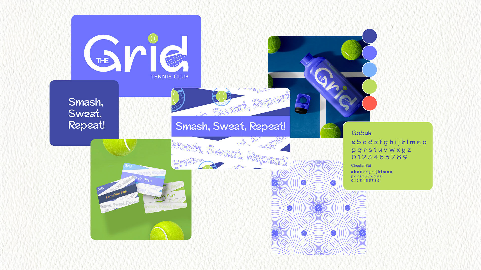
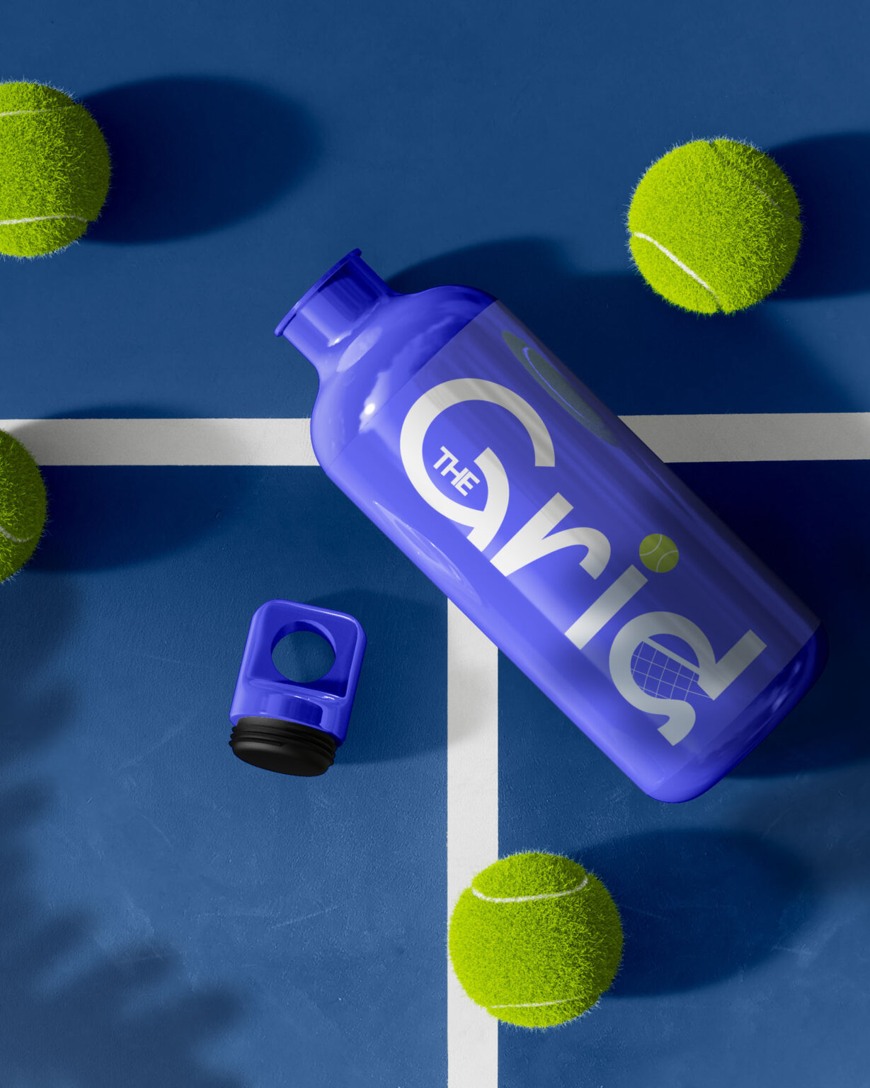
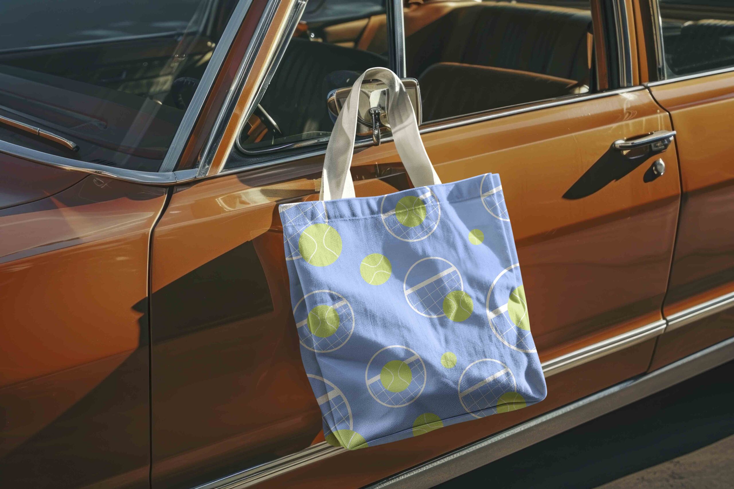
A repeatable pattern based on spin arcs and serves ties assets together, from water bottles and totes to social tiles.
Membership cards use bold color blocking and large typography for instant tier recognition and quick gate checks. The voice is upbeat and invitational, headlines like “Smash, Sweat, Repeat!” capture the club’s training-meets-community vibe.
Across touchpoints, the system delivers immediate recognition, clear hierarchy, and a youthful energy, a coherent toolkit that simplifies operations and turns every interaction (on-court and online) into part of the Grid experience.